Process Breakdown
Click below to view sources
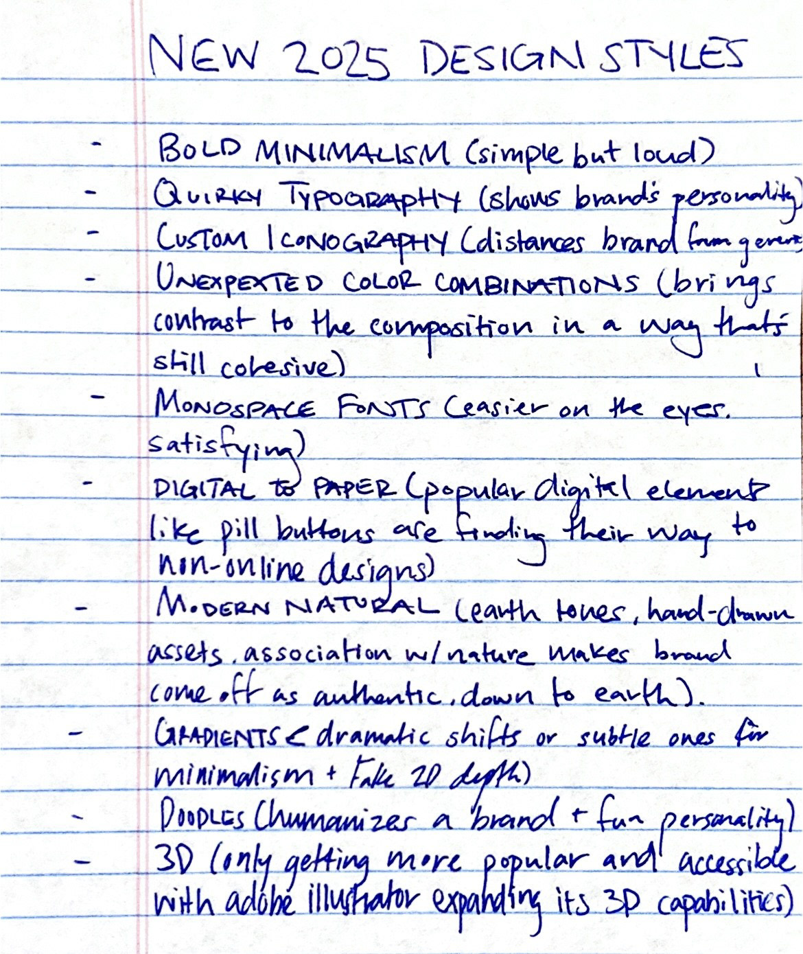
While researching where the world of design was headed in 2025, I gained insight into which trends were picking up and which trickled down from 2024. According to Jukebox Print, the main trends that carried into the new year are gradients, 3D, "digital to paper" (UI design elements that have made their way to the physical design world), bold minimalism, and monospace fonts.
3D's relevance in design has only thrived and taken up more space as time has passed. With programs like Blender being available for everyone free of charge and the expansion of 3D capabilities in softwares like Adobe Illustrator and Firefly, 3D is here to stay. This makes it easier to understand the endurance of gradients in design as they can turn 2D elements into faux 3D graphics.
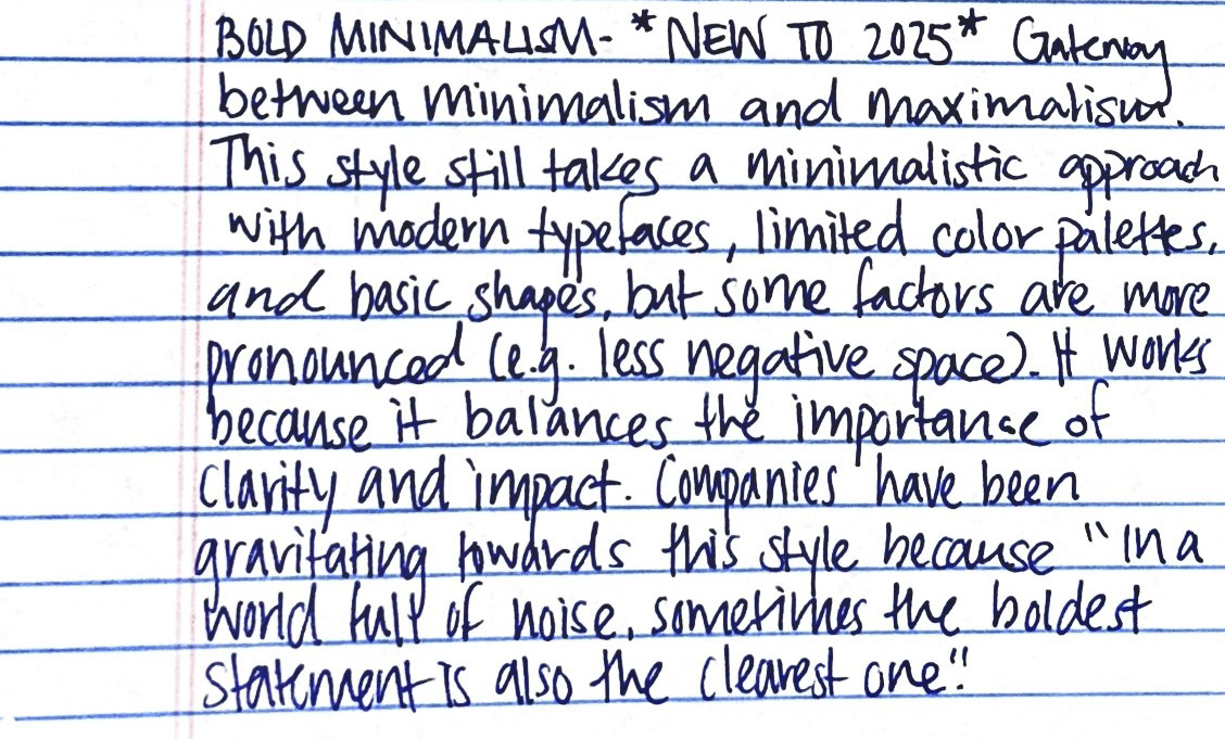
As for the emergence of "digital to paper" designs we've seen in recent years, it's no shock that this has persisted when the use of UI elements in digital and physical brand designs make the transition between the respective outlets that much easier. It's hard for certain fonts types to disappear en masse but there has been positive reception to monospace fonts with the rise of what some describe as "bold minimalism". This is a gateway between minimalism and maximalism that balances the importance of clarity and impact. Monospace fonts assist in this with their readability and visual cohesiveness.
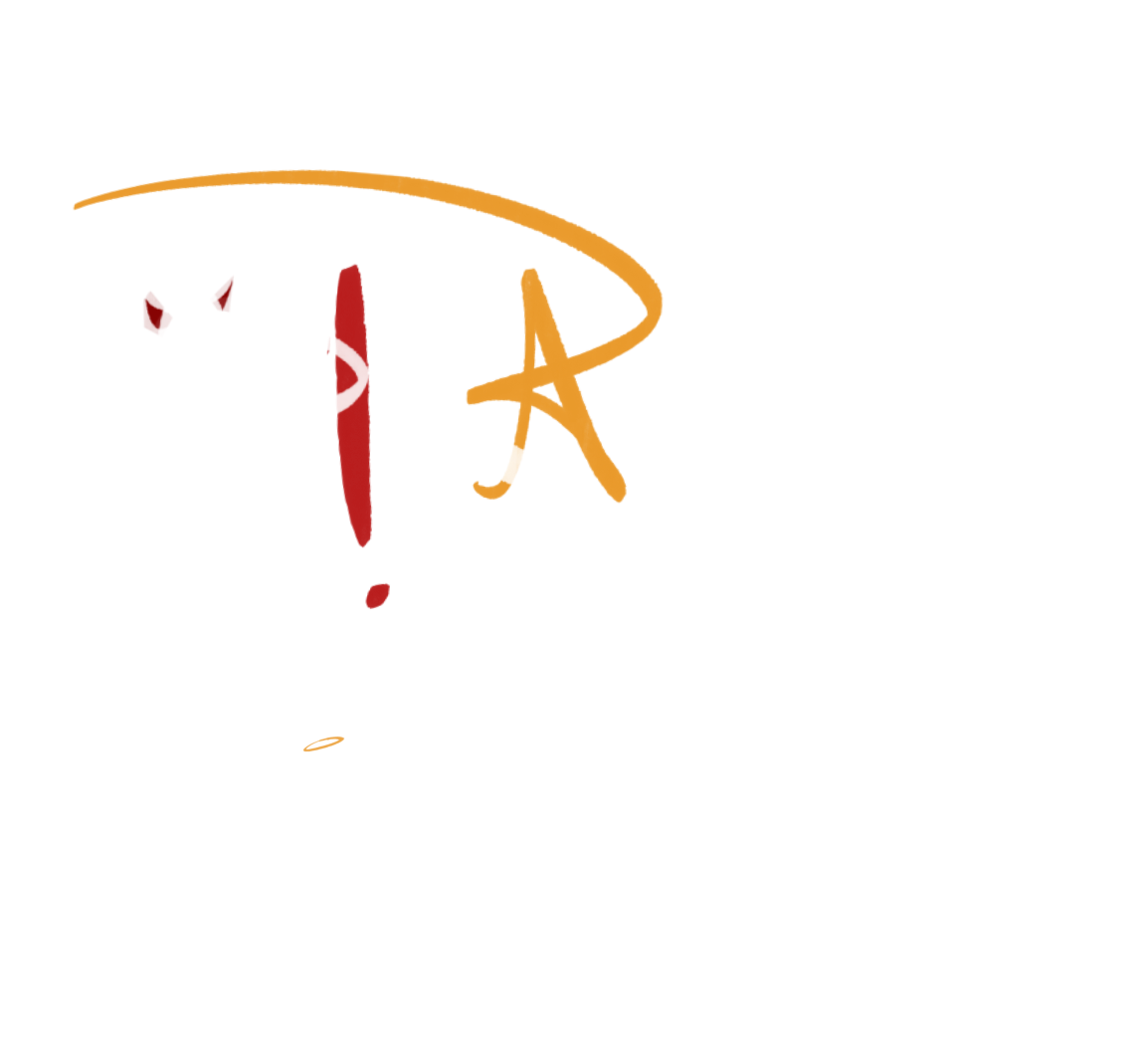
With this piece, I wanted to keep it simple but use some of the design trends from the list. I chose to incorporate the "modern natural" earth tones with the last 2 color changes in the piece, bold minimalism similar to the Cold Culture brand font, and gradients with the Colorama effect. Now that I'm in the know about relevant design trends, I'd like to create another piece using the elements I missed.