Process Breakdown
Click workspace photos for more details
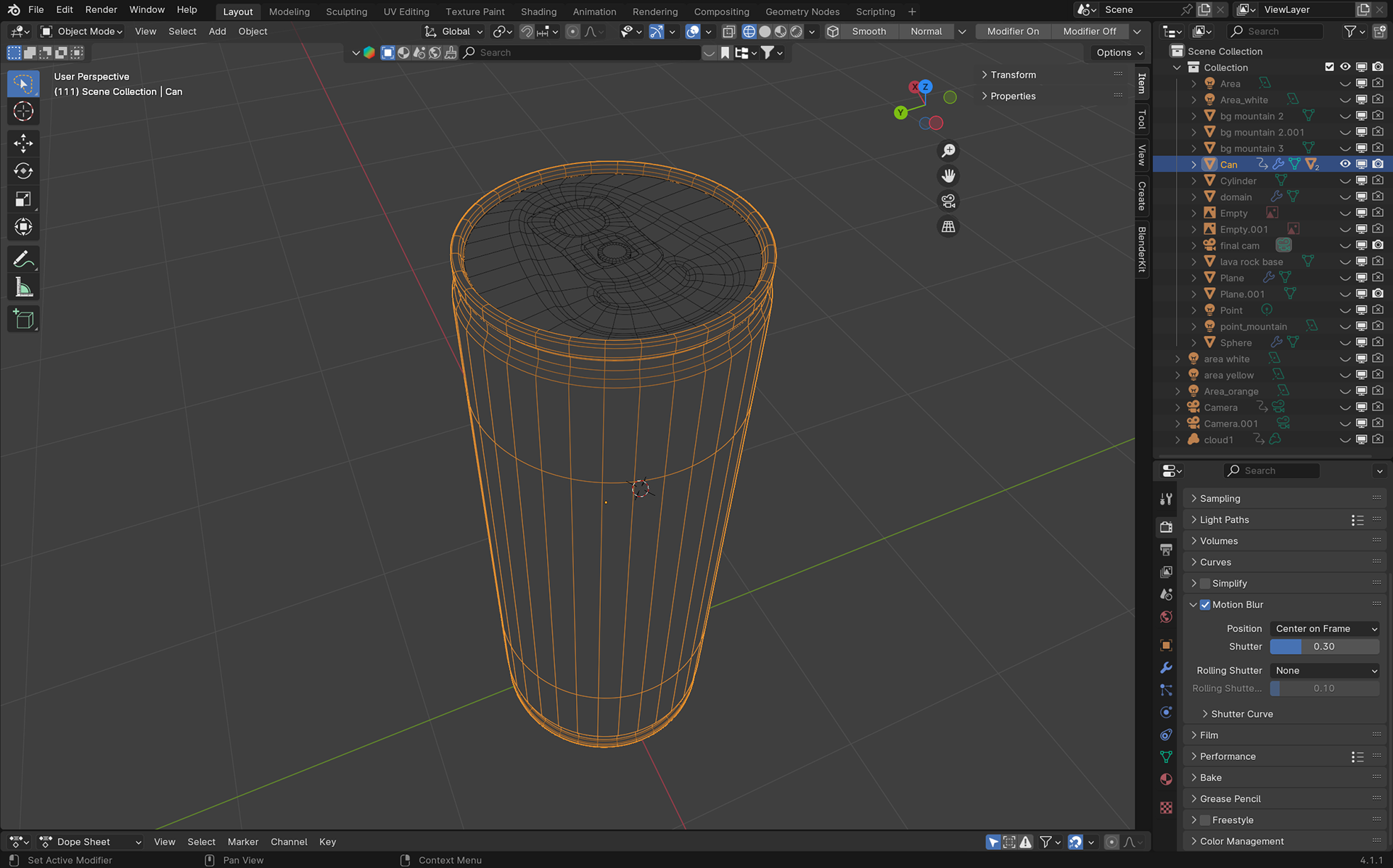
Mesh View: Can modeled by me

Texture Map View: Created by me in Photoshop
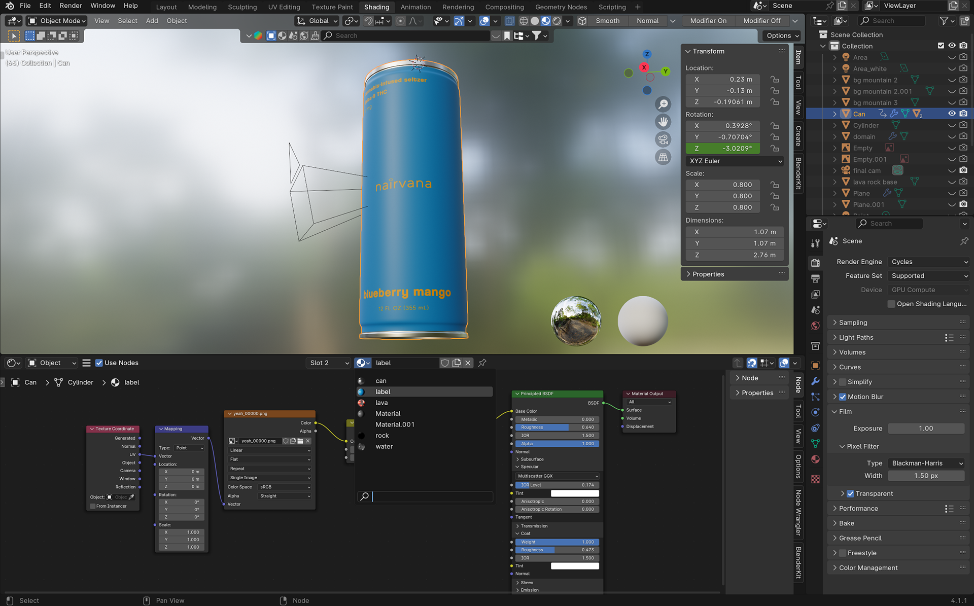
Shader View: Can texture by me
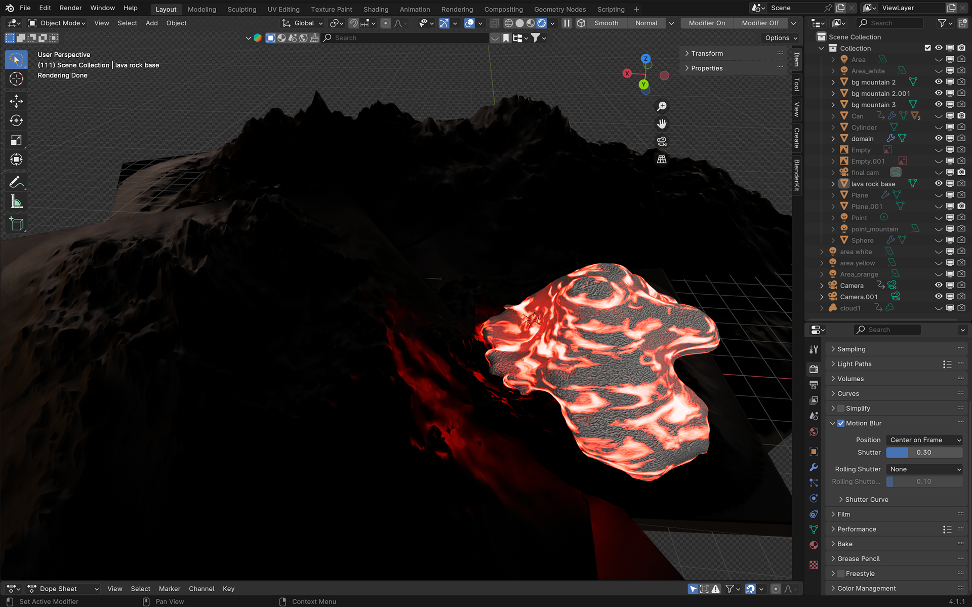
Lava View: Lava texture by me, Mountain texture from textures.com
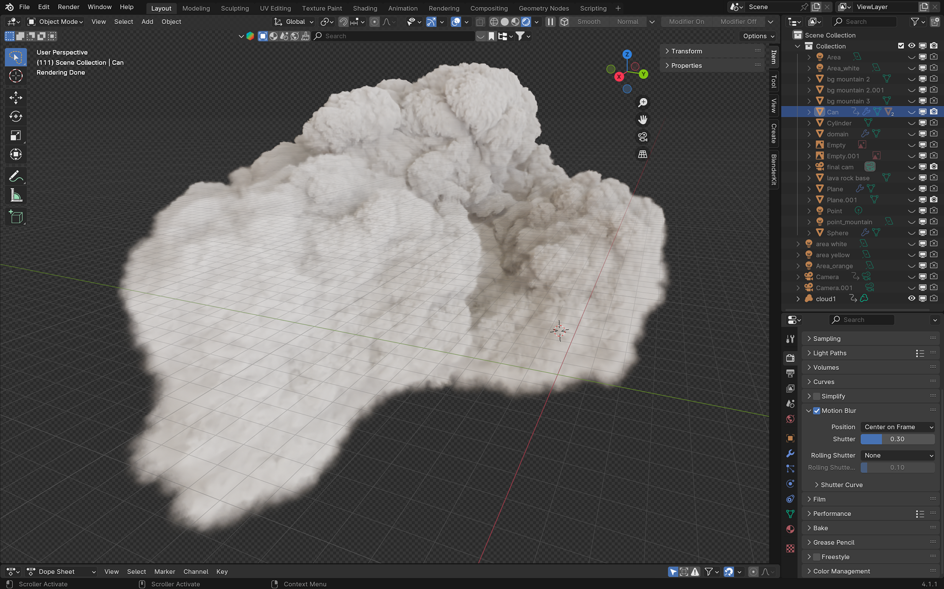
Cloud View: Cloud VDB by Samuel Krug VFX on Youtube
My design process for this project was straight-forward: I want to promote a drink and, like most famous companies, the brand would use my name; so, I decided on fusing "Nair" (pronounced nye-er), with "Nirvana". The idea to create a THC seltzer seemed to best translate the concept of reaching nirvana and reaching a high.
With the image of nirvana at the root of the brand, I toyed with heaven & hell visuals. The location of the ad starts off in hell and transitions into heaven to signify Nairvana as the transportive vessel that gets you to this place of eternal bliss.
I chose blue as the base color (at least for this specific seltzer flavor) because it invokes feelings of serenity and is ideally the state one would slip into with this drink. The text color was given an orangey-yellow hue to compliment the blue, and chose a minimalistic font to continue off the idea of calmness.
I chose blue as the base color (at least for this specific seltzer flavor) because it invokes feelings of serenity and is ideally the state one would slip into with this drink. The text color was given an orangey-yellow hue to compliment the blue, and chose a minimalistic font to continue off the idea of calmness.